Leeham News and Analysis
There's more to real news than a news release.
Alaska Air’s brand refresh after 25 years
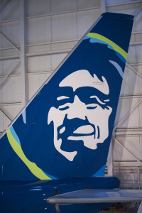
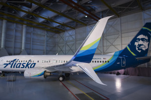
Jan. 25, 2016: Alaska Airlines announced its first rebranding in 25 years today, revealing a new livery and  new logo font.
The airline is in a fierce battle with Delta Air Lines, as the latter develops Seattle into a major hub, adding domestic flights to feed its international routes. Seattle is Alaska’s principal hub and with its sibling Horizon Air continues to maintain a 51% market share.
The new look is an evolution, not a revolution, the company said in a statement. The traditional Alaska  colors remain and are enhanced, and the Smiling Eskimo, the logo of the airline since 1972, receives tweaks but essentially remains the same, “with vibrant new colors.”
The new livery and logo remained a secret until the unveiling, an unusual success when it comes to new airline paint jobs and plane spotters. The aircraft was painted in Victorville (CA), with those involved under a Non-Disclosure Agreement, an Alaska spokeswoman told LNC. Employees at Seattle were told the plane would fly in at 0630, but it was snuck in at 0100. Employees involved in the flight and parking the plane in the hanger were sworn to secrecy.


I wonder when Americans will stop using the word “Eskimo”. I assume that native Americans in Alaska are Inuit as they are here in northern Canada. Perhaps someone has additional information about Alaskan indigenous people.
There several groups of Native Americans here in Alaska with different languages and cultures. They include the Tlingit, Haida, Aleut, Athabascans, Inupiaq Eskimos, and Yupik Eskimos. The leading statewide organization representing Alaska Natives is the Alaska Federation of Natives (AFN), which is chaired by a Yupik women. AFN uses the word “Eskimo” in its logo. Regardless of the Canadian practice, I don’t think there is any disrespect implied in the use of the word “Eskimo” in America, at least, the Alaska portion of America.
From this website called Wikipedia…
“While since the late 20th century numerous indigenous people viewed the use of the term “Eskimo” as offensive, because it was used by people who discriminated against them, in its linguistic origins the word did not have an offensive meaning. Alternative terms, such as Inuit-Yupik, have been proposed, but none has gained widespread acceptance.
In Canada and Greenland, the term “Eskimo” has fallen out of favor as pejorative and has been widely replaced by the term “Inuit”, “Alaska Natives”, or terms specific to a particular tribe. However, under U.S. and Alaskan law (as well as the linguistic and cultural traditions of Alaska) “Eskimo” refers to all indigenous peoples of Alaska, of which the Inuit are merely the majority; the term also includes groups as the Aleut, who share a recent ancestor with the Inuit and Yupik groups, but also to the largely unrelated indigenous peoples of the Pacific Northwest Coast and the Dene, who descend from other, unrelated major language and ethnic groups…”
More news and pictures at the Alaska Dispatch News website:
http://www.adn.com/article/20160125/alaska-airlines-fleet-gets-new-look-amid-continued-growth
Hmmm…this reset is not much better than American’s rebranding which borders on tacky or gaudy. This is not enduring design but merely a trendy flair to a very seventies logo. Perhaps it would have been better altogether to abandon the native Alaskan and go for something more universal to Alaska.
What would be more universal to Alaska? A moose?
Regardless the “Smiling Eskimo” is an timeless, iconic brand image that you don’t just abandon.
Well they did try some years back and the revolt stopped it pretty quickly.
Alaska understandably wanted to be more than just an Alaska carrier but forgot that’s where its roots and identity are.
Not a bad idea….a flying moose! I Do like it for, perhaps, their cargo division.
“You’ll also see the airline’s iconic Eskimo face logo, informally known as Chester, which has adorned the fleet’s tail fins almost continuously sine 1973. Most sources I’ve read claim that he is an Inupiat named Oliver Amouak.”
So its a no-no to say hes is ‘Inuit’
http://www.grayflannelsuit.net/blog/history-airline-logos-us-top-10
Interesting background for the 10 airlines and their logos ( click through)
“The Eskimo first appeared in 1972, when Alaska adopted a four-logo paint scheme – a totem pole, to represent the native culture of Southeast Alaska; a gold miner, to represent the booming gold rush days in Alaska; Russian spires, to represent early Russian heritage in the state of Alaska; and a native Alaskan adorned in a traditional qulittaq (parka with ruff) to represent the Arctic region and its people. Indigenous Alaskans in the Arctic, traditionally of Inupiat or Yupik descent, commonly refer to themselves as Eskimo.”
http://blog.alaskaair.com/alaska-airlines/who-is-the-eskimo/
If “Chester” had been removed, there would probably be more comments decrying how bland and anonymous the livery had become. To get so wound up over the political correctness of a plane’s paint scheme is a bit overly sensitive, no? FTR, I like it. It’s different and distinctive. Better than something as trite as a silhouette of Denali, for instance.
Why does Alaska Air use Che Guevera as their icon?
Good one. I think it might be Robert Forster.
What is funny is to read the press release, all sorts of whiz, spin, zing. with deep meaning. Me thinks the PR needed something to do.
I just think its a pretty nice paint job, definitely better than most of them.
Who had the pathetic Gray planes? American? ergh. talk about depressing.
And I guess you would have to ask the various tribal groups in the Inuipit /Yupic grouping how they feel. I think they are kind of proud to represent Alaska even if not technically correct and Eskimo while not truly correct was never a pejorative up here.
Keep in mind there is also some pretty good self humor up here as there is one basketball team (I think their only sport) called the Half Breeds. They choose the name, it was not forced on them in any way.
Here an article in German about the reasons to stay with a brand.
http://www.aerotelegraph.com/lufthansa-logo-seit-52-jahren-unveraendert-die-gruende
The cooperate design was developed by
https://en.m.wikipedia.org/wiki/Otl_Aicher
I don’t know about further afield, but the Alaskan Airlines logo in the Pacific NW and in Alaska seems to mostly be appreciated as a familiar if not somewhat endearing corporate logo….
OK. The verdict is out. He is well-loved and endearing. He can be compared to the Quaker Oats logo. Maybe its just the silly splash of colour that seems so fleeting and trendy. ( yes, I do know that Alaska does fly to southern climates and has for some time) Yes, Lufthansa is a very good example of a marque that has endured over time and made evolutionary changes without succumbing to the flavour of the month graphics.